
Data visualization


Turning your data into insights
As a freelance data analyst (with a geospatial bias), I translate data into valuable and comprehensible insights. My goal is to improve results, make the right decisions and save costs. I am experienced in usING data visualization techniques to present the results. I use SQL, R, D3js, Python, PostgreSQL and Tableau for my data projects.
I am a big open source believer since I think with sharing solutions we can achieve a lot more as a community. Therefore I prefer to use R and python for my daily work. A list of my top data analysis projects, in the form of Jupyter Notebooks and Colab Notebooks are available on Github.
On this webpage, you will find some examples of my projects, most of them are personal and others links to a websites or interactive visualizations.
Have fun in browsing through the content and thank you for visiting!
I want to help others to make the right decisions, data-driven decisions
Data analysis
I am specialized in analyzing data. Results, trends and recommendations are clearly presented in reports or tools.
ExampleData analytics
Get more value from your data with prediction models and machine learning techniques, for example by predicting behavior or targeting the right customer.
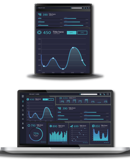
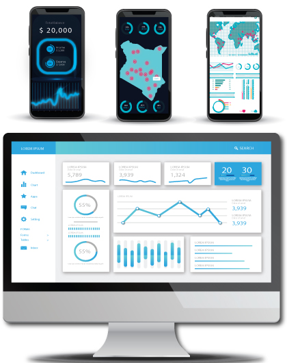
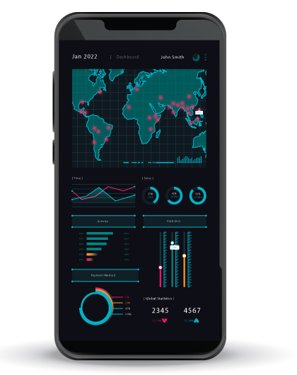
ExampleDashboards
Dashboards show the most recent results in an interactive way. By clicking and drilling, you will examine trends and patterns yourself.
ExampleRendered data visualisations
Do you want to work together? Please reach out to me by via collins@collinsmido.com
Copyright © 2026 Collins Mido. All Rights Reserved